I am writing this blog to make readers aware of how “Cognitive Loading” impacts UX designing and what software engineering needs to take account while developing their products.
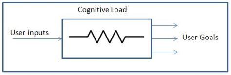
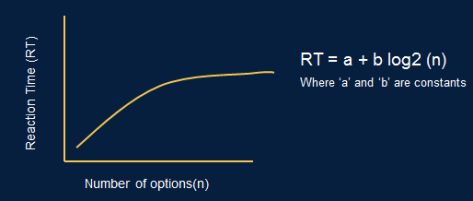
If your new to UX designing I would recommend you read my blog (User Experience (UX) Design) in my blog space. Cognitive Loading term can be traced back to “Cognitive Load Theory” which was developed by John Sweller and he has published a paper on the subject in journal Cognitive Science in 1988. “Cognitive load” relates to amount of information that a person’s working memory can hold at any one point in time. To understand this definition better we need to understand how human beings process information. The diagram below shows this information cycle:

The Long-Term Memory can store almost infinite amount of information and each time your recall an information a neural path is created sometimes information can have errors or corrupted in someway but its still reliable enough to keep us functioning. The Working Memory is where Cognitive loading take place and primary reason being it can keep track of on an average only 7 plus or minus 2 information at any point in time, with training it can increase a little, but stress and other emotional factor can interfere with it. The Long-Term memory encodes information based on how many hooks it has to it and some amount of repetition is required to store and multiple sensory information provide additional hooks to store required information for example smell is one of sensory input that can get strongly encoded along with information so certain smell can invoke strong memory recalls.
Sweller in his paper mentions about three types of Cognitive Load intrinsic, germane, and extraneous, each one is explained below:
- Intrinsic load is related to integral complexity of an idea or set of concepts. For example, in programming world, learning to program in scripting language is much easier than doing it with OOPS language.
- Extraneous load is due to design of instructional materials to learn a new concept or to process and idea. Inefficient instructional designs adds to unnecessary load. For example, an audio-visual presentation format usually has lower load than a text format because working memory has less information to process and more hooks to recall.
- Germane load relates to degree of effort involved in processing, construction and automation of schemas. Germane load is sometimes also associated with motivation and interest.
Intrinsic load is unchangeable, whereas the instructional designer can manipulate extraneous and germane load. In UX designing we will have to balance between extraneous and germane load although users of of our product may not be learning a new idea or concept reducing their cognitive load will make our software easy to use. The topics discussed here will be more concentrated on reducing extraneous load. So you can think of cognitive load as giant resistor that stops users from achieving there goals and less resistance that our product generates better UX will be delivered to them.
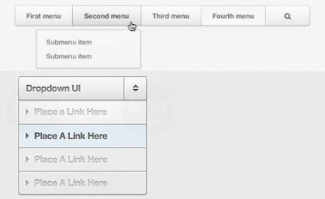
We as software developers and consumers have at some point in life seen a UI like the one shown in image below:

Its a nightmare scenario where if you have to update one piece of information you need to scan though the whole UI. Even though its partly grouped users still have to scan his eyes to find relevant information. The technique discussed below can be applied to software product to reduce their cognitive load.
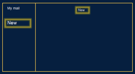
Recognition over Recall
To retrieve information effortlessly from Long-Term Memory we need external sensory stimuli like a familiar text, sound or smell (Recognition) in absence of stimuli it takes extra effort (Cognitive Load) to recall the information.
The Recognition over Recall methodology is a powerful technique and one of the reasons why people like a Graphical User Interface (GUI) over a Command Line Interface (CLI). The GUI provides menus, option selections, buttons and many other ways to use your product once user has seen your product he can recognize it from past experience and choose appropriate action he wants to take, whereas in command he needs to recall all options he need to use and there is no assistance available to him. A GUI can also show a workflow and what step user currently is doing and how many more to go, these are very helpful in reducing Cognitive Loading.
Just by using a GUI your software product does not reduce Cognitive Load you need to organize your User Interface(UI) in such a way that its easier to for users to reach their goals. The developers understanding of business domain plays very crucial role as it will lead to effective workflow design and showing appropriate information on screen when user expects to see it or might need it. For example providing Intellisense assist feature for programmer or providing similar features whenever you can to user can greatly reduce your users workload, with Machine Learning become easier to implement day by day, any kind of advanced assistance provide by your product easily increases its appeal.
Progressive Disclosure
This becomes a very important Cognitive Load reduction technique when your product needs to display lot of information to end users. For example e-commerce website like amazon uses Progressive Disclosure very effectively amazon sells millions of products to end users and they effectively categorize the product their retailers want to sell and as user search for it progressively discloses product catalog reducing burden on users. You will never find amazon listing everything on their home page.
This technique requires your software to be like an intelligence agency where agents on assignment are given information on need to know basis. The more effective your chain of disclosure more effective your software product is. Again I would stress that knowing your products users or domain of your target customers will provide an effective way to implement Progressive Disclosure, remember that users can only work with max of 7 things on screen at a time keeping this number lower makes user more effective and he feels productive while using your software.
Highlighting
This Highlighting technique is used grab user attention to a portion of screen, the choosing of color for highlighting must be carefully done so it grabs users attention but does not hurt his eyes if he keeps staring it at for longer time. Highlighting must be used sparingly and only in case of critical error or changes are happening and chances of user will miss to notice it on screen. Over using this causes user to shut it out and you may not be able to get users attention. Most modern UI avoid highlighting as much as possible unless its really required usually secondary highlighting technique are used like changing color or make red or yellow asterisk(*) or any other way of giving feedback is used to report change in status. They key to effectively use this is to be consistent and use the same highlighter for similar severity or operation.

Mapping
This is the easiest to identify but can be hardest to implement in software product. The idea of mapping is to represent a real world object as it is or model it in a way that its easy to understand and relate. For example in olden days the control panel of industrial machinery had knobs, switches, toggle switches, levers and analog meters now with advent of computer controls product developers try to keep them as its to make it easy for human operators to use and understand. Another example I can give is shown below we have gas stove with 4 burners, if controllers of burners are arranged as shown in right side image its easier for users to understand and not make mistake of turning the wrong one on\off.

As mentioned early try to achieve mapping in software product may be hard at times like mimicking a knob lever or analog meter may be hard is time consuming for developers when computers can show them as numbers and user can manipulate the numbers easily, but whenever mapping is done right it makes very good UX and sometimes require less help information or affordance needs to be displayed on screen for user to interact.
Affordance and Entry Point
An affordance is possibility of an action on an object or environment, for example we all know how to hold a cup, the handle of cup acts like an affordance does not require any explanation.

Similarly in software product it should be easier to identify the affordance like what is a label, what is text field, what is a button. If a new affordance is introduced it should be used as per its original intent and in consistent way. Even though this sounds very dumb many developers trying make their software look cool sometimes mess it up, I have seen websites where I cannot differentiate between a label and text box or a hyperlink and a underlined text. Use affordance consistently in once screen if it looks like button other screen it looks like clickable label it will frustrate users. I have seen cases where developers tries to fool people like having a large close button with text and ‘X’ mark in ad popups, you will be able to close ad only if click ‘X’ mark this is not a good practice and users will feel that they are deceived.
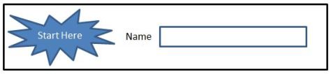
An Entry point is a marker or hint on how to begin using an object or start a process. When the UI has two many objects to interact with if its not straight away evident what user need to do then we need to drop a hint or marker like start here this is know as an Entry Point. A need for entry point can be easily identified by showing UI to new user who has not seen it previously and if he feels stuck or need to think for a length of time to determine what he needs to do next. If your UI is very workflow oriented then this may not be required as user knows where he is and how to get to his end goal.
Constraints
Every user problem a software product is trying to solve will have rules and constraints its the job of software to make sure user does not enter anything invalid or perform an action in wrong order or ahead of time before all inputs are provided. Some of the rules may be enforced by management like licence terms to avoid miss use of software and also make sure user pays fee to use software.
How you enforce these rules in your product will matter on how UI looks and behaves when constraints are violated or conveys it to user. The ideal scenario is to have “Poka yoke” mechanism enforced. Poka Yoke means “mistake-proofing” in Japanese and was applied by Shigeo Shingo in 1960s to industrial processes designed to prevent human errors. Many of our day to day products that we use Poka yoke for example an electric socket you will never make a mistake while connecting an electric plug to a socket, sometimes I feel this should have been taken a step further and sync with the switch on\off position so user does not plug or unplug the socket when switch is on position to prevent an arcing.
In case of software product ensure all user inputs are validated never assume that user never makes a mistake or he is smart most user are in hurry or under pressure to meet a deadline and can make lot of mistakes while working and even a simple error made by user may take a long time to recover if your business process is complex and if a crucial validation is missing in processing logic. Other important way to enforce is to ensure UI screen flows as per constraints and enable\disable or hide\unhide controls as required but ensure they errors and exception conditions are properly handled you do not want a button to be permanently disabled because of bug in your code. The last way to enforce is to make sure you include forgiveness in your product where user can make mistake and recover them quickly as soon as he realizes it.

Feedback
This is very important especially if your working with application that work on slow network or time consuming process. The idea behind Feedback is to acknowledge every user input action this leads to better UX as users know that your application is not stuck and doing the operation its suppose to do. The best example for this I can give is the Like button on Facebook app if you hit it multiple time it will acknowledge even though there is no network connectivity and will temporarily queue it and retries to complete it later and if it does not work it asks user to retry.
Feedback will reduce user frustration a lot, they will like your product. Please make sure if your operation involves unreliable infrastructure like network operation, time consuming database operation or File system operation try to give an effective feedback to user as to what your software is doing and give option to cancel whenever possible and retry again a responsive software is considered better than a non responsive ones even though user may be waiting for same amount of time for an operation to complete.

Confirmation of Action
This is not a technique, whenever user does an action that cannot be recovered or is irreversible then its standard practice to show confirmation of his action with a dialog. The image below shows such a conformation dialog which windows show when your about to elevate the permission of a program.
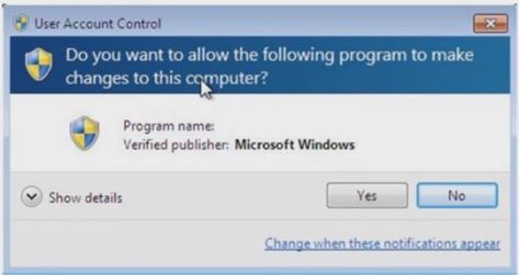
The Conformation of Action is required but must be used sparingly over use of this will lead to user unconsciously accepting confirmation. One of the best practice I see in this area is giving user a setting to whether he needs see confirmation dialog. This allows user to choose which actions he want confirmation before executing and for which he does not want. Another good practice is to adopt forgiveness technique wherever possible but this requires additional coding but is worth the effort.
Forgiveness
This technique involves making all operation in your software as reversible operations with an option to become permanent at some check point or after confirmation from user. This is used in many of the modern software products they provide soft delete options with time limit or undo user actions. This allows users to make mistakes and recover from them easily. Implementing Forgiveness means writing lot of additional code and having bigger memory footprint, but it pays off in terms of UX.

Further Reading
The mantra to reduce Cognitive Load of users is “Don’t Make me Think” as mentioned by Steve King and title of book he authored. If your user has to think hard at any point or get stuck while using your product then you have failed. You can read the below two books to further enhance your knowledge on reducing Cognitive Load and enhance UX.
- Don’t Make me Think – Steve Krug
- Rocket Surgery Made Easy – Steve Krug


 But problem with this is if you change the UI even a little bit it can irritate users a lot and he may need to retrain himself to adopt to this change, making revolutionary changes next to impossible.

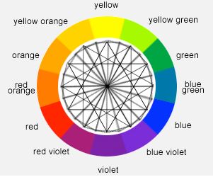
 We can develop a good Monochromatic UI screens by using just shades and tint version of a Hue. For example a company may associate its logo or website with a particular Hue color and then can use the variation of that color to design UI for its software product this will help users to strongly associate your company with its color. Companies like coco-cola are very particular about the red color of there cans, even slight variation in color is unacceptable causing a perfectly good can to be knocked of from the production line.

