Category Archives: Software Design

Software design posts and pages

Cognitive Loading in UX Design

I am writing this blog to make readers aware of how “Cognitive Loading” impacts UX designing and what software engineering needs to take account while developing their products.

If your new to UX designing I would recommend you read my blog (User Experience (UX) Design) in my blog space. Cognitive Loading  term can be traced back to “Cognitive Load Theory” which was developed by John Sweller and he has published a paper on the subject in journal Cognitive Science in 1988. “Cognitive load” relates to amount of information that a person’s working memory can hold at any one point in time. To understand this definition better we need to understand how human beings process information. The diagram below shows this information cycle:

Information Processing

The Long-Term Memory can store almost infinite amount of information and each time your recall an information a neural path is created sometimes information can have errors or corrupted in someway but its still reliable enough to keep us functioning. The Working Memory is where Cognitive loading take place and primary reason being it can keep track of on an average only 7 plus or minus 2 information at any point in time, with training it can increase a little, but stress and other emotional factor can interfere with it. The Long-Term memory encodes information based on how many hooks it has to it and some amount of repetition is required to store and multiple sensory information provide additional hooks to store required information for example smell is one of sensory input that can get strongly encoded along with information so certain smell can invoke strong memory recalls.

Sweller in his paper mentions about three types of Cognitive Load intrinsic, germane, and extraneous, each one is explained below:

  • Intrinsic load is related to integral complexity of an idea or set of concepts. For example, in programming world, learning to program in scripting language is much easier than doing it with OOPS language.
  • Extraneous load is due to design of instructional materials to learn a new concept or to process and idea. Inefficient instructional designs adds to unnecessary load. For example, an audio-visual presentation format usually has lower load than a text format because  working memory has less information to process and more hooks to recall.
  • Germane load relates to degree of effort involved in processing, construction and automation of schemas. Germane load is sometimes also associated with motivation and interest.

Intrinsic load is unchangeable, whereas the instructional designer can manipulate extraneous and germane load. In UX designing we will have to balance between extraneous and germane load although users of of our product may not be learning a new idea or concept reducing their cognitive load will make our software easy to use.  The topics discussed here will be more concentrated on reducing extraneous load. So you can think of cognitive load as giant resistor that stops users from achieving there goals and less resistance that our product generates better UX will be delivered to them.

Engineering Explanation For Congnitive Load

We as software developers and consumers have at some point in life seen a UI like the one shown in image below:

BulkRenameUtility

Its a nightmare scenario where if you have to update one piece of information you need to scan though the whole UI. Even though its partly grouped users still have to scan his eyes to find relevant information. The technique discussed below can be applied to software product to reduce their cognitive load.

Recognition over Recall

To retrieve information effortlessly from Long-Term Memory we need external sensory stimuli like a familiar text, sound or smell (Recognition) in absence of stimuli it takes extra effort (Cognitive Load) to recall the information.

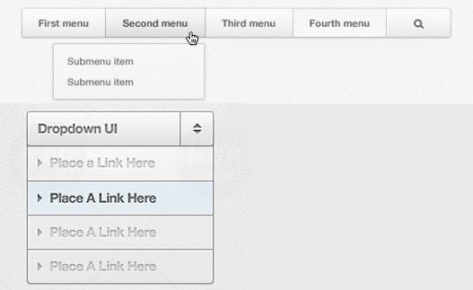
The Recognition over Recall methodology is a powerful technique and one of the reasons why people like a Graphical User Interface (GUI) over a Command Line Interface (CLI).  The GUI provides menus, option selections, buttons and many other ways to use your product once user has seen your product he can recognize it from past experience and choose appropriate action he wants to take, whereas in command he needs to recall all options he need to use and there is no assistance available to him. A GUI can also show a workflow and what step user currently is doing and how many more to go, these are very helpful in reducing Cognitive Loading.

Just by using a GUI your software product does not reduce Cognitive Load you need to organize your User Interface(UI) in such a way that its easier to for users to reach their goals. The developers understanding of business domain plays very crucial role as it will lead to effective workflow design and showing appropriate information on screen when user expects to see it or might need it. For example providing Intellisense assist feature for programmer or providing similar features whenever you can to user can greatly reduce your users workload, with Machine Learning become easier to implement day by day, any kind of advanced assistance provide by your product easily increases its appeal.
RecognitionOverRecall

Progressive Disclosure

This becomes a very important Cognitive Load reduction technique when your product needs to display lot of information to end users. For example e-commerce website like amazon uses Progressive Disclosure very effectively amazon sells millions of products to end users and they effectively categorize the product their retailers want to sell and as user search for it progressively discloses product catalog reducing burden on users.  You will never find amazon listing everything on their home page.

This technique requires your software to be like an intelligence agency where agents on assignment are given information on need to know basis. The more effective your chain of disclosure more effective your software product is. Again I would stress that knowing your products users or domain of your target customers will provide an effective way to implement Progressive Disclosure, remember that users can only work with max of 7 things on screen at a time keeping this number lower makes user more effective and he feels productive while using your software.

ProgessiveDisclosure

Highlighting

This Highlighting technique is used grab user attention to a portion of screen,  the choosing of color for highlighting must be carefully done so it grabs users attention but does not hurt his eyes if he keeps staring it at for longer time. Highlighting must be used sparingly and only in case of critical error or changes are happening and chances of user will miss to notice it on screen. Over using this causes user to shut it out and you may not be able to get users attention. Most modern UI avoid highlighting as much as possible unless its really required usually secondary highlighting technique are used like changing color or make red or yellow asterisk(*) or any other way of giving feedback is used to report change in status. They key to effectively use this is to be consistent and use the same highlighter for similar severity or operation.
Highlighting

Mapping

This is the easiest to identify but can be hardest to implement in software product. The idea of mapping is to represent a real world object as it is or model it in a way that its easy to understand and relate. For example in olden days the control panel of industrial machinery had knobs, switches, toggle switches, levers and analog meters now with advent of computer controls product developers try to keep them as its to make it easy for human operators to use and understand. Another example I can give is shown below we have gas stove with 4 burners, if controllers of burners are arranged as shown in right side image its easier for users to understand and not make mistake of turning the wrong one on\off.

Stovemapping

As mentioned early try to achieve mapping in software product may be hard at times like mimicking a knob lever or analog meter may be hard is time consuming for developers when computers can show them as numbers and user can manipulate the numbers easily, but whenever mapping is done right it makes very good UX and sometimes require less help information or affordance needs to be displayed on screen for user to interact.

Affordance and Entry Point

An affordance  is possibility of an action on an object or environment, for example we all know how to hold a cup, the handle of cup acts like an affordance does not require any explanation.

Affordance_Coffee_Cup

Similarly in software product it should be easier to identify the affordance like what is a label, what is text field, what is a button. If a new affordance is introduced it should be used as per its original intent and in consistent way. Even though this sounds very dumb many developers trying make their software look cool sometimes mess it up, I have seen websites where I cannot differentiate between a label and text box or a hyperlink and a underlined text. Use affordance consistently in once screen if it looks like button other screen it looks like clickable label it will frustrate users. I have seen cases where developers tries to fool people like having a large close button with text and ‘X’ mark in ad popups, you will be able to close ad only if click ‘X’ mark this is not a good practice and users will feel that they are deceived.

An Entry point  is a marker or hint on how to begin using an object or start a process. When the UI has two many objects to interact with if its not straight away evident what user need to do then we need to drop a hint or marker like start here this is know as an Entry Point. A need for entry point can be easily identified by showing UI to new user who has not seen it previously and if he feels stuck or need to think for a length of time to determine what he needs to do next. If your UI is very workflow oriented then this may not be required as user knows where he is and how to get to his end goal.

Entry_Point

Constraints

Every user problem a software product is trying to solve will have rules and constraints its the job of software to make sure user does not enter anything invalid or perform an action in wrong order or ahead of time before all inputs are provided. Some of the rules may be enforced by management like licence terms to avoid miss use of software and also make sure user pays fee to use software.

How you enforce these rules in your product will matter on how UI looks and behaves when constraints are violated or conveys it to user. The ideal scenario is to have “Poka yoke” mechanism enforced. Poka Yoke means “mistake-proofing”  in Japanese and was applied by Shigeo Shingo  in 1960s to industrial processes designed to prevent human errors. Many of our day to day products that we use Poka yoke for example an electric socket you will never make a mistake while connecting an electric plug to a socket, sometimes I feel this should have been taken a step further and sync with the switch on\off position so user does not plug or unplug the socket when switch is on position to prevent an arcing.

In case of software product ensure all user inputs are validated never assume that user never makes a mistake or he is smart most user are in hurry or under pressure to meet a deadline and can make lot of mistakes while working and even a simple error made by user may take a long time to recover if your business process is complex and if a crucial validation is missing in processing logic. Other important way to enforce is to ensure UI screen flows as per constraints and enable\disable or hide\unhide controls as required but ensure they errors and exception conditions are properly handled you do not want a button to be permanently disabled because of bug in your code. The last way to enforce is to make sure you include forgiveness in your product where user can make mistake and recover them quickly as soon as he realizes it.
Constraints

Feedback

This is very important especially if your working with application that work on slow network or time consuming process. The idea behind Feedback is to acknowledge every user input action this leads to better UX as users know that your application is not stuck and doing the operation its suppose to do. The best example for this I can give is the Like button on Facebook app if you hit it multiple time it will acknowledge even though there is no network connectivity and will temporarily queue it and retries to complete it later and if it does not work it asks user to retry.

Feedback will reduce user frustration a lot, they will like your product. Please make sure if your operation involves unreliable infrastructure like network operation, time consuming database operation or File system operation try to give an effective feedback to user as to what your software is doing and give option to cancel whenever possible and retry again a responsive software is considered better than a non responsive ones even though user may be waiting for same amount of time for an operation to complete.

Feedback.jpg

Confirmation of Action

This is not a technique, whenever user does an action that cannot be recovered or is irreversible then its standard practice to show confirmation of his action with a dialog. The image below shows such a conformation dialog which windows show when your about to elevate the permission of a program.

ConfirmationOfAction

The Conformation of Action is required but must be used sparingly over use of this will lead to user unconsciously accepting confirmation. One of the best practice I see in this area is giving user a setting to whether he needs see confirmation dialog.  This allows user to choose which actions he want confirmation before executing and for which he does not want. Another good practice is to adopt forgiveness technique wherever possible but this requires additional coding but is worth the effort.

Forgiveness

This technique involves making all operation in your software as reversible operations with an option to become permanent at some check point or after confirmation from user. This is used in many of the modern software products they provide soft delete options with time limit or undo user actions. This allows users to make mistakes and recover from them easily. Implementing Forgiveness means writing lot of additional code and having bigger memory footprint, but it pays off in terms of UX.

Forgivness

Further Reading

The mantra to reduce Cognitive Load of users is “Don’t Make me Think” as mentioned by Steve King  and title of book he authored.  If your user has to think hard at any point or get stuck while using your product then you have failed.  You can read the below two books to further enhance your knowledge on reducing Cognitive Load and enhance UX.

  • Don’t Make me Think – Steve Krug
  • Rocket Surgery Made Easy – Steve Krug

User Experience (UX) Design

In recent years User Experience(UX) Design has become very important part of software industry.  As multiple softwares are providing similar service to users a good UX can mean life or death for your software product\service and in worst case your company.

 Introduction

The UX  design involves taking into all aspects of owning and using a software product by end users  like installation, usage, updates, end of life, etc. The UX designing in recent years has become as important as designing software itself.

The UX is not just limited how the software User Interface(UI) looks, many software engineers think a good UX is delivered only through a good UI. This is the most common mistake made by engineers, when user complains software is  looking outdated, hard to use and understand,  engineers introduce cool colors and re-arrange UI controls or software workflow but since this is done at very end of software development life cycle making it expensive and difficult to make lot of changes.

You may wonder why UX came into picture recently in software industry. When computers where first developed it was developed by engineers and scientists to be used by themselves or by other engineers\scientists. The geeky users of computers knew how computers worked from inside and out, also hardware was very expensive so user base was smaller lot of shortcuts where taken and lot of burden laid on shoulders of these geeky users which they carried happily as it reduced there work even with complexity of using a difficult User-Machine Interface. If you see the computers used by NASA during the Apollo missions your respect for astronauts will grow multiple folds with all the complexity involved with space flight using its computer was a lot harder where they had to switch memory cards to load different programs and execute them in the right order and these programs did not even have names they had just a number which they had to recall/lookup and execute.

The UX design is a branch of study on its own, this blog highlights some important aspects of designing a good UX like Visual Perception, UX Design Principles and also simple tips on how to use colors.

L-Brain vs R-Brain

You may wonder why I am dragging brain into an UX blog, as everything that we understand and create originates in our brain as ideas and thoughts its very important to understand how it functions. As most of you know our brain is classified into two hemisphere Left(L-Brain) and Right (R-Brain). The L-Brain does all logic process, analysis and other intellectual function but it can process only in sequential order. The R-Brain does all the visual, audio, creative thinking and it can process information in parallel.

The processing done by R-Brain feels like magic to us and its difficult to train like L-Brain and measure. All our academic education is focused on L-Brain. The L-Brain is pride of an engineer. Making good UX design is considered more of an art than science, so most engineers find doing UX hard and sometimes are intimidated by an UX expert.

This blog gives you set of design principles, thumb rules and guidelines that an UX expert uses. As you read through this blog you will discover there is lot of science involved designing a good UX. Even though you may not become an expert at UX but you can follow these rules and guidelines and  avoid common pitfalls which developing your software.

Our brain has neuron called  mirroring neuron these neuron allows us to socialize and mirror things that we consider as good. In recent year I have noticed that newer softwares have better UX than older ones, one of the reason being when we see experience a good software product or feature we tend to mimic it. Since companies like Google, Facebook,  Microsoft and Amazon invest heavily in UX to make there products better we engineers who use them have started mimicking them.

What software engineers are doing wrong?

To do the right thing and avoid common pitfalls while developing a software product and come up with a good UX, we need to understand what we are doing wrong. I am listing down most usual things that we are doing wrong:

Software products are very rude

This things is very easy to spot in most software. As soon as a softwares dependent infrastructure starts to fail or a mistake is made by user the way software handles the error speaks volumes how much taught was given on designing its behavior. As test of human character is when a person is facing the most adversity. A test of good UX is when software product has to deal with infrastructure failures and user mistakes.

The error, warning and constraint messages shown by our software are really bad many times they contain confusing and technical lingos which users do not understand. Many times we just ask users to click on OK button, when its really not ‘OK’. The messages we show hardly has information on how to recover from erroneous condition which most of the time they can by retrying certain step and most users do sometimes making matter worst in some scenarios.

Software products has very poor behavior

In UML modelling we model software with structure and behavior. So when designing a software we need to model the behavior very carefully as users tend to think software as an matured adult but in reality it behaves like an adolescent child. It forgets what we tell creates a huge mess half the time its used. I can give you many examples of software that asks you to save your work just because you opened a document and have not a done a single edit operation, this kind of behavior causes user to lose trust in the product. Many such poor behavior can be noted in your product. These days with advancements in display technology and programming language its easy to come up with a software that looks cool so I think we need to take care of behavior end of the product which requires entering into end users mind. We should keep our engineering hat aside while testing UX behaviour.

Humans do most of the work

To use a computer an end user must learn a lot of things about how it works and how different software products like OS, Browser, editors, command shell, etc can be used in combinations. He even has to have some idea about how to use the hardware like connecting a device to a computer and install drivers etc. With plug n play technology this overhead has been reduced  a lot. If you observer carefully you can still see that humans do most of the heavy lifting while using a software product they need to know the dos and don’ts, rules and constraints while performing any operation many products are not intuitive by nature.

As more and more software products are being produced each year and list of things to remember on how to use them keeps growing causing users a lot of frustration and if a rival companies comes with a slightly better interaction model they will just switch over.

Ignorance about users

When a software product is being created the end users are last things in software engineers mind; engineers are more concentrating on how various software components  needs to be put together to solve business problem and also dealing with various interaction problems among the components. The software engineer hardly thinks about the human machine interaction and UI is just clumsy way for user to enter data and view. This ignorance about end users becomes a big problem as solution provided may not match with what user expects he may not be able to see the data both raw and processed ones as he wants.

The engineers have limited UI controls based on software frameworks used this limits how engineers present the data to user. A rich UI may lead to complex interaction model and UI code making it difficult to maintain the UI code. The software engineer may not get this luxury of time to come up with a good UI which is closer to user expectation, this leads to compromise and degree of compromise made decide how good the UX will be. So ignoring end users may lead to death of your software product even though you have designed the internals of software well.

Conflicting interests

When a software product is being built there are multiple stakeholders involved (investors, management, support teams,development team, etc.) and not just the end users, each stakeholder have their own expectation from the product and sometimes they conflict like investor may decide that one feature or business problem is more important than other. The development team may want to use one technology to development whereas management want to use another. With tighter deadlines the development and testing team may not be able to give much attention to UX. Until recent years UX has been alien concept for many and usually not given the priority it requires. So managing these conflict in a product development cycle is very important and making sure stakeholders understand the importance of UX.

Lack of a  UX design process

These days we have process for every aspect of software development from conception to deployment to post release support. The scrum process in agile methodologies is one of my favorite. The UX design also has process which can be accommodated into your existing software development process. One of the process is Goal Directed Design it provides methodologies on how to approach on UX design. A book by steve krug-Rocket Surgery made easy also gives us a good insight on how to go about UX designing. Understanding these process on how to approach on designing a good UX  and blending it into existing development process is vital. Not doing these can lead to unhappy customers and unusable product.

Visual Perception

The human eye is the most important sense organ. We perceive the world around mostly through our eyes it feeds us with almost 80% of external information. For many of our day today activities eyes are very important. Naturally we decide how good or bad a software is through our eyes, that’s why a lot of attention is paid on how software looks and renders useful information to users,so they can see and process them. Even software responsiveness is even decided by our eyes. By understanding how our brain uses our eyes to process information we can provide a good UX to end users.

The Gestalt Principles

The word Gestalt means “unified whole”  and is a psychology term. In 1920s  German psychologists developed a set of theories on visual perception which came to known as Gestalt principles. By understanding this principles we can develop better software that human can use as it directly connected with how we process information in our brain as seen through our eyes. Its known that human beings can process and retain structured information 40% better than unstructured information. The subsection below is dedicated to very important gestalt principles.

The Gestalt principles of Similarity

The Gestalt principle of similarity states that things which have similar visual characteristics such as shape, size, color, texture, value or orientation will be seen as belonging together.

Gestalt Similarity

In the image above user will assume that similar looking stars are having same meaning or importance even though its a random arrangement brain tries draw some meaning out of it. So when user sees a UI controls, text with similar fonts, size and color that look similar in your software as to be same and expects them to behave the same way, if this expectation is not met then user can get frustrated a lot. This principle states how consistent look and feel along with behavior is so important for success of your product.

The Gestalt principle of proximity

The Gestalt principle of proximity states that things which are closer together will be seen as belonging together.

Gestalt Proximity

In the image above even though user sees same stars since they are together he assumes there is some meaning or structure between them even if it is a collection of heterogeneous group. In software product when a user is shown with a form related things should be kept closer together making it easier for user to connect them and related operation should be kept together for example copy and paste operation must be under edit group. If your product is solving a complex business problem they should take care of proximity by represent business data or model  in well organized way that matches user expectation of that domain, any mismatch in this will lead to confusion and leading users to making mistakes making your product harder to use.

The Gestalt principles of Symmetry

The Gestalt principle of symmetry states that objects that are symmetrical with each other will be more likely to be grouped together than objects not symmetrical with each other. Basically it states that the fact that we prefer symmetric appearances over asymmetric ones, this means if you place UI controls in a symmetric arrangement user find it easy to view it and are going to like it better.

Gestalt Symmetry

The image above illustrates symmetry we have stars presented in a uniform manner making it easy for eyes to recognize them and process. The symmetry makes it easy for the brain to see the information and it builds a high of level trust and confidence in your software.

Other Gestalt principles

In above section I have discussed the three most important principles which can apply to any software product that needs an UI.  I am listing down few others which can also add to better UX but must be applied carefully and requires good judgement on how to use them.

  • The Gestalt principles of Figure and Ground
  • The Gestalt principles of Continuity
  • The Gestalt principles of Closure
  • The Gestalt principles of Law of Common Fate

I am leaving these principles in your hands for you to explore further.

UX Design Principles

The UX design principles discussed in below if followed can make your software product very user friendly to use. When developing or enhancing any part of your software product have them as a check list see if you can apply them.

The Pareto principle (80/20 Rule)

This is my favorite principle and is applicable to many other fields. The Pareto principle is named after economist Vilfredo Pareto, it specifies an unequal relationship between inputs and outputs. The principle states that 20% of the inputs is responsible for 80% of the results obtained. Putting it another way, 80% of consequences stem from 20% of the causes.

If your wondering how this principle applies to UX if you see any software product users they tend to use only 20% of features provided to them. If you cater to different groups of then there 20% set may vary. So when your developing software knowing this 20% product feature will allow you to exclusively concentrate on them and invest most of your development and testing effort on them. So whenever your asked to develop a feature think really hard, see if its really required. During software development developers, product managers and users can sometimes get carried away and think for lot of feature which are not at all used.

Consistency

This very important principle when developing your product you need to ensure you have your UI has a consistent look and feel. Ensure that similar operations are done in similar way and have consistent behavior. Make sure you have consistent error handling.  Consistency is very easy to achieve but if your not paying attention to this principle then you can just as easily mess it up. A consistent behaving product is more trusted and is believed to be more reliable its just like trusting a person. Once trust is lost it can be hard to regain.

Hick’s law

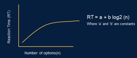
Hick’s Law is named after a British and an American psychologist team of William Edmund Hick and Ray Hyman. The simplest way to state Hick’s law : The time it takes for a user to make a decision is directly proportional to possible choices. The decision time increases logarithmically. The diagram below shows Hick’s law formula.

Hicks_Law

This means that we need to reduce the number of options that we show to end users, by keeping UI simple and limiting number of choices.  This may not be always possible so we can reduce the user reaction time:

  • By categorizing the choices user has to make.
  • By obscuring complexity by hiding least used option and progressively disclosing them.
  • By assisting the choice decision by making frequently used option bigger or by using different color or background.  We can see may real world examples like in a lift the Lobby button is made larger than other floor buttons.

If you ignore this law and design complex UI layouts then only way to reduce reaction time is to train the users; like astronaut trains for a space missions.
Space Shuttle But problem with this is if you change the UI even a little bit it can irritate users a lot and he may need to retrain himself to adopt to this change, making revolutionary changes next to impossible.

Fitts’s Law

Fitts’s law is named after researcher Paul Fitts. Its a model of speed-accuracy tradeoffs used in human–computer interaction and ergonomics, it  predicts time required to acquire a target on screen as a function of the distance to the target and the size of the target. The diagram below shows Fitts law.

Fitts_Law

Basically it highlights the Importance of Size and Distance in UI Design while placing your control. The real world example of this can be seen in many places we keep the on button small and off button bigger so its easier to hit and stop a machine in case of emergency. In software if we have a email client like below:

Fitts_Law_Mail_Client

We can predict that user will click the New button on the left more to compose a new email instead of the one on the right. The one on the right may be used but its usage will highly depend on how close mouse pointer was too it. So make sure you size your controls according to importance and also provide related options together so user can easily chose it.

Intentional Blindness

The human eye is great sensor and helps us process information at very high speeds, but it also has its limitations, even though we have a good peripheral vision we can focus and process information only at a very small portion of what we see. The area of focus is as small as 1 cent coin.  Its the processing speed of our brain that allows us to do complex activity such as driving a car around, so we need to constantly shift our focus while driving to allow us to see different moving objects on the road and judge speed and distance quickly and react to any danger.

CentsCoin

A good UX designer can take advantage of this limitation and can change UI layouts according to options user select on one side of the screen without user eye noticing the change. The main thing to keep in mind it should not cause any flickering while changing and also should blend in with existing theme. Designers can also show complex UI on screen as long as its structured correctly user will filter the complexity out because of this natural filter.

White space

In early days of computers,  programming language and hardware had limited power in terms of UI controls and their manipulation. UI controls on screens where much harder to add, remove or change than these days, this caused engineers to pack the screen with all sort of controls with all information that can be shown to user. This made the UI very difficult to use but since it could do most of the repetitive and boring work, users continued to use them.

With advance in technology both in programming language and hardware allows to change UI controls much better now, we can implement complex workflow and change UI rapidly. This lead to invent of using of white space in screen, most successful software companies use white space effectively best example is Google, the search page has lot white space but still provides all option you need to use it. So we should design UI that are uncluttered and should provide a minimum options that user needs to choose from while performing any operation. Even if your UI controls are packed they should appear  blend well together instead of distinct chunks.

White Space

Using Colors

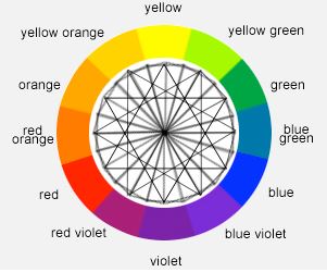
Colors are another difficult subject an UX designer has to tackle. The recommended way to use go use a Color wheel.  The color wheel has these special properties:

Color Wheel

  1. Diagonally opposite  colors are complimentary and can be used as foreground and background colors.
  2. Triad colors are complimentary and can be used in combination to develop an UI screen.
  3. Analogous colors are groups of three colors that are next to each other on color wheel, they to are complimentary and can be used in combination to develop a screen.
  4. If color wheel is split vertically then side which has shades of blue are considered cool colors and opposite side is considered warmer colors. The thumb rule hear is always use a warm color on a cool color background so its clearly visible.

Now that we understand what color wheel is lets understand whats Hue, Shades and Tint are:
Hue: Hue is a basic color formed using an RGB.
Shade: Shade is process of mixing black color to the Hue.
Tint: Tint is process of mixing white color to the Hue.
We can create our own shade or tint of a Hue to create additional colors. The diagram below shows how mspaint provides this option. The slider in right controls the shade and tint property and left side color box allows us to choose a Hue.
MsPaint We can develop a good Monochromatic UI screens by using just shades and tint version of a Hue. For example a company may associate its logo or website with a particular Hue color and then can use the variation of that color to design UI for its software product this will help users to strongly associate your company with its color. Companies like coco-cola are very particular about the red color of there cans, even slight variation in color is unacceptable causing a perfectly good can to be knocked of from the production line.

Its recommended to limit color to maximum of 5, most standard apps use somewhere between 3 to 5 colors unless your gaming company or a creative company which has unique user base and following using more is not advised.

Last but no least do not rely solely on colors to convey information there are color blind users and they may have hard time using your software. Also beware a color also carries implicit meaning in different cultures and demographics. Colors can also be associated with positive and negative sentiments. Using wrong color for a given audience may work against your product.

Further reading

You can further read about UX designing in below books:

  • About Face 3-The Essentials of Interaction Design – Alan Cooper, Robust Reimen & David Cronin
  • Design with Mind in Mind – Jeff Johnson

Google has put a lot of effort to make UI look better so we can find a lot of insight by going through Google Material Design website https://material.google.com/

For website developers and designers they can use Theme Forest website to get ready made template that have good UI design https://themeforest.net/item/avada-responsive-multipurpose-theme/2833226.